Monday 28 November 2011

Music Magazine Front Cover Sketch


This is the front cover sketch for my music magazine, I decided to call it AMPLITUDE, as this was what the majority of  people wanted from the questionnaire, and i think it fits well with Dance/house music, the picture i wanted was 'too complicated' of Sam, but i tried to take one as close to as possible, with the ray bans on to 'mask' in a way what kind of person he is, thus having to read the article to discover all about him. After looking at various magazines I saw that my idea had too many articles on the front, and on most of the better selling mags, (not  always music) the plainer they are the more effective they are and stand out on the shelf, also there aren't too many articles trying to grab your attention, that you end up not even picking up the magazine at all. The title was also too complex with the amplitudinal wave to make, and wouldn't look very good if i took a picture of a picture.

Publication Plan

Audience Research Results and Conclusion


CONCLUSION:
these results helped me choose a lot about my magazine. I am not the biggest fan of dance/house music but I went for this because this is what the audience wanted from the results. Amplitude was the majority leader of what the magazine should be called and it fitted in with the dance music style. Second was plectrum but this would of been the name only if I did a rock or guitar type magazine. I decided for it to be a weekly magazine, although it didn't matter as the research was equal with 10 going for monthly and 10 for weekly. Dance was the favourite for the genre, and close second was dubstep, but i went for dance as I had no clue about dubstep music or the artists involved! The colour scheme should be red/black according to the results so I went for this as the others weren't as vibrant and dance music is normally vibrant. Finally the price I went for £2.50, which was inbetween the £2-£3 bracket which was what the majority of people wanted to pay.

From these results I can see that almosts all aspects of the magazine were influenced by the feedback from the questionnaire, by doing this I feel that I have gave the 'consumers' what they want in a magazine, and the majority of people will buy it. Although if my questionnaire had of been more far spread, and handed out to different people, or areas, my results may have been very different

Audience Research Questionnaire

Sunday 27 November 2011

Conventions of magazine double page spread and analysis


These are my conventions of Double-Page Spreads (or DPS for short). I decided to use an article on the best Dance venues from Mix Mag, the leading Dance music/DJ magazine. and one from NME on Florence and the machine. I noticed that the layout/style all depends on the genre. Mix Mag's was very bright and crowded, where as NME was smooth, and easy on the eyes to read. This almost typifies what kind of person the reader is by what they are reading. Mix Mag would probably be for under 25's where NME would be 25 and over

initial ideas for interview with Sam

these are my initial ideas for my double page spread on Sam Swaffield, who is a DJ on the manchester clubscene and in the group s'il vous plait. I have known him for 5 years because he is my cousin's boyfriend. I have been to a few of his gigs some old and some recent so I know quite a bit about him and his music life, so i decided to interview him for my DPS. I did a list of question's I was going to ask him when I ent to his house before a gig. They did change slightly and i decided to leave out the opening bit as it wasn't needed/that relevant.

Tuesday 22 November 2011

Powerpoint analysing music magazine cover pages and contents


These are the analysis' of professional contents pages and front covers, that I did. I decided to choose the well know music magazines, Kerrang, Q, NME etc. As these are the music magazines buyers will know most about the layout. I decided to do two front covers, and two contents pages. Just to show how magazines can differ in layout, sometimes very differently

Monday 21 November 2011

Research into the music magazine industry


This was some work I did on the music industry, I found out what the circulation figures were in the last year on music magazines, and the results were quite surprising, It seems that most people just aren't buying magazines anymore as the figures were all down so many %! This would probably be because of the recession as people don't have as much disposable income to spend anymore on stuff they want, they barely have enough to pay for the stuff they 'need'. I also found out the different types of publishers and what magazines they published, usually the top 20 music magazines, are all owned by 4 or less publishers.

Sunday 20 November 2011

Music Magazine - Initial Ideas, Research into music magazine marketplace and initial plans


these are my initial ideas for the music magazine, you can see that it has changed a lot because of the lack of votes for this in the questionnaires and the big demand for a dance music magazine. I also researched Q magzine, and Kerrang to see the price, frequency, issue size, regular content and feature articles. This gave me a rough idea of how I wanted my magazine to be and I did a rough plan on what mine were going to be like. This gave me a better idea of what i wanted with frequency and price of my magazine, even though the genre changed

Friday 18 November 2011

original images for college magazine- plus comments

  
This was the picture i used for the front cover of the magazine. it shows the rocker on his guitar in a checked shirt. it clearly shows a serious facial expression


This picture was meant to be used as the front cover but didn't show the face so it couln't be used.


This picture was used in the contents page for the article "learn how to play the guitar in two weeks" it clearly shows a rocker playing his guitar


This is a picture of the tv with the character on the tv, this was used in the contents page for an interview with a made up rapper DR Smith


 I decided to use this picture for the contents page, he is the editor of the college magazine, as he looks intelligent and serious enough to spend his time editing the magazine


I chose to use this picture in the contents page as it for the complete guide to rock fashion as this is typical rock fashion with the band t-shirt, and long hair.

Tuesday 15 November 2011

College Magazine Contents Page

This is my final design for my college magazine content's page. It has all the main features of a content's page including a bold 'contents', a title on their, an index and a few short insight into the main articles/pages. I have also used a message from the editor, which is on most magazines. I wanted to make the contents page stand out, yet still give all the information the potential buyer will need to hopefully be persuaded to buy. The pictures used were all taken around college, the page 50 pic was also taken in college but of a person on the tv hense the slightly lesser quality than the others.

My Front Cover Evaluation

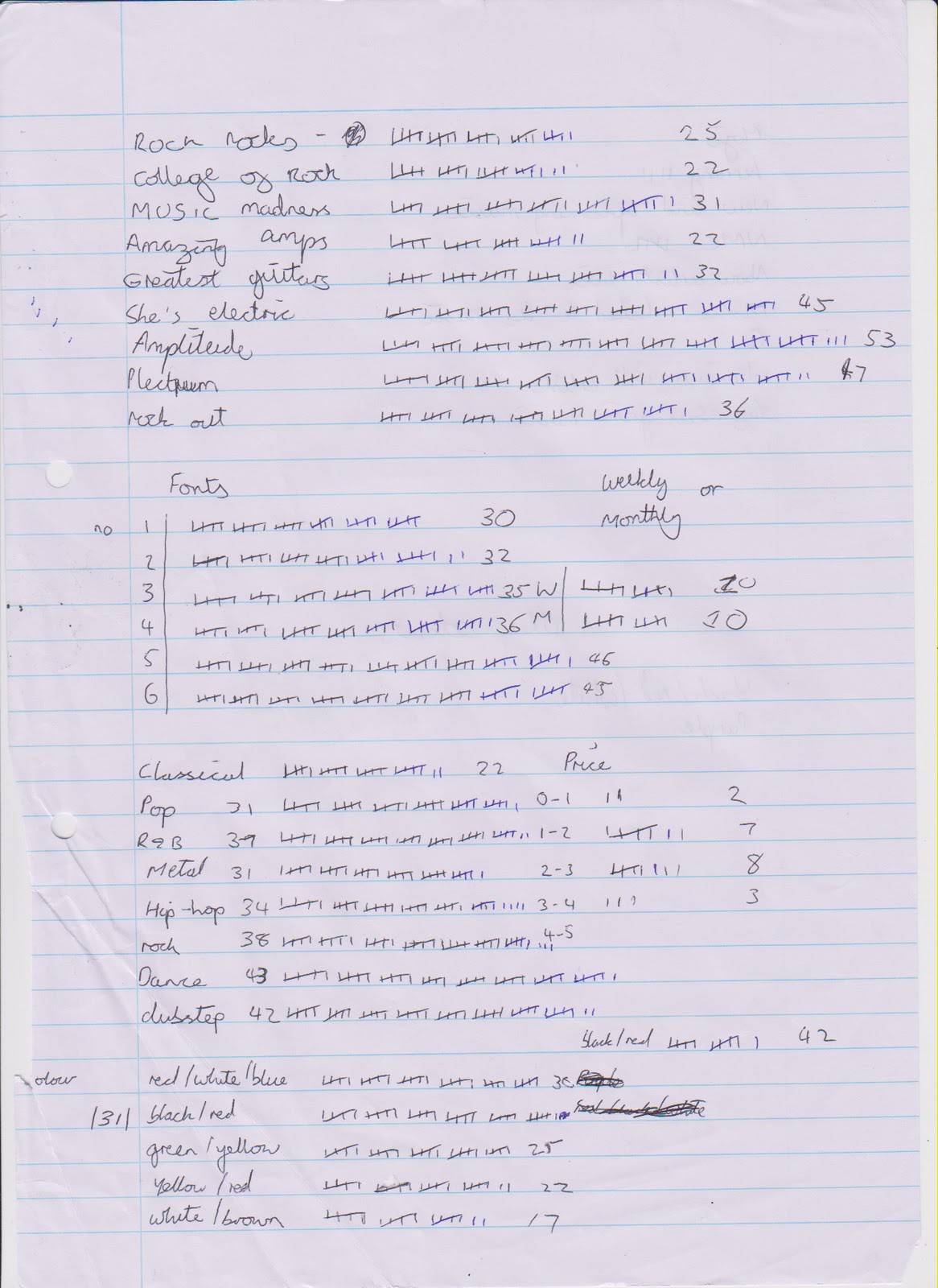
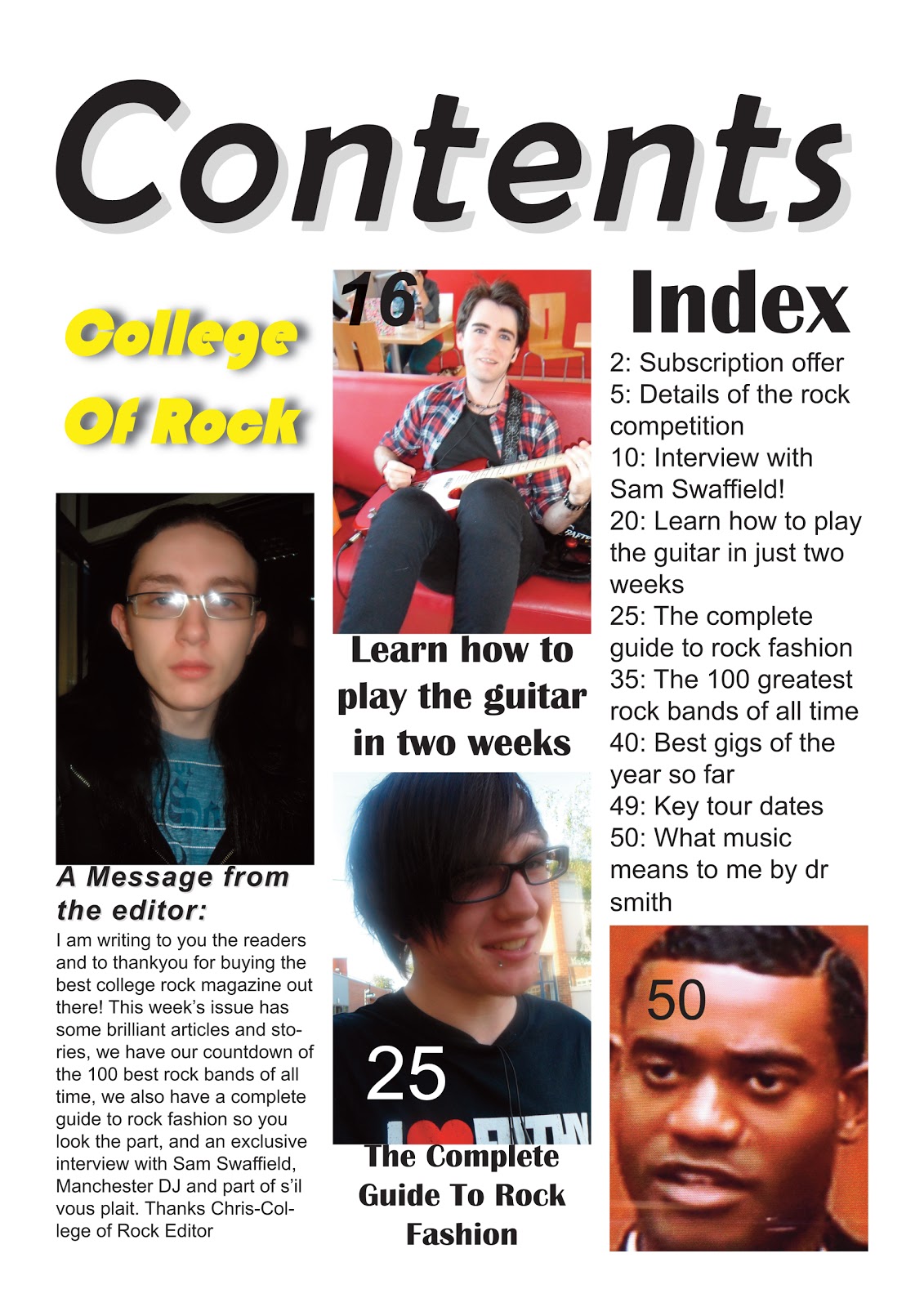
Ø  My magazine is called College Of Rock, I chose this idea as I felt there was a gap in the market of college magazines that music/rock related, it will be issued monthly and will cost £2 per issue, an affordable price for teenagers to pay.
Ø  The colour scheme is a dark black with white/grey text, similar to rock which is quite dark yet with a bright/vibrant side. I chose this colour scheme because it matched the models guitar used which was black and white
Ø  The quality of the cover photograph is very good as it was done at home using an expensive £4,000 canon camera which I borrowed from my stepdad who is a professional freelance photographer, it was stretched and moved lots of times yet the quality still remained the same as the original photograph
Ø  The lighting was positioned to make sure the face and the facial expression was the most visible, yet you can still see clearly his clothes and guitar.
Ø  The model in the photo is wearing a hooded check shirt along with black jeans (which you can’t see in the photo, this is typical rock attire, yet if I was to redo the photo I would probably have him wearing some kind of rock band t-shirt.
Ø  For the hair and make up, no make u­p was used, his hair is medium length and is spiked in a Mohican style, and rockers either have Mohican short/medium hair or really long hair, so this stays in the typical conventions of a rocker.
Ø  The facial expression of the model is a stern one, with his lips apart slightly and his head tilted to the left a bit, he is staring right at the camera so it looks as a reader that he is directly looking at you.
Ø  The masthead font used was Orator Std, as it was simple but very effective and stands out. The font size was 400pt (Photoshop). The colour of the mast head is white with lots of graphic effects to make it look more like a grey colour. I positioned the title so it was at a slight angle so looked better than just straight which most magazines use.
Ø  For the Cover lines I also used Orator Std, the colour was white again with a similar amount of graphic effects as the masthead but not as many, so it looks slightly different. The size used is 174.99 pt (Photoshop). They were arranged around and on the photo but none covered the face, they were spread out so they didn’t looked crammed in and all in one place on the cover, leaving lots of free space which looks unprofessional.
Ø  The graphic effects I used were drop shadow, inner shadow, outer glow, inner glow, bevel and emboss and satin. These all made the magazine stand out and catch the potential buyers on eye on the shelf, so they are more likely to buy the magazine.

My Magazine Front Cover


This is the final design for my college magazine front cover, I have used my step brother for the front cover and featured a guitar and clothes similar to what a rock star would wear. the fonts I kept basic yet still stand out with some of the glow effects used etc. it features a bar code as all magazines do, and a few headlines, giving the reader an idea of what is inside. I wanted to keep it basic as it is a college magazine, not a proffessional attempt read by millions, and for me the content was more important. Whereas on a proffesional music magazine, NME etc they need to entice buyers by the front cover, if the consumers don't like what's on the front cover or it doesn't catch their eye, they probably won't buy it! even if the content may be very good.