Q1. In what ways does your media product use, develop or challenge forms and conventions of real media products
Cover Page
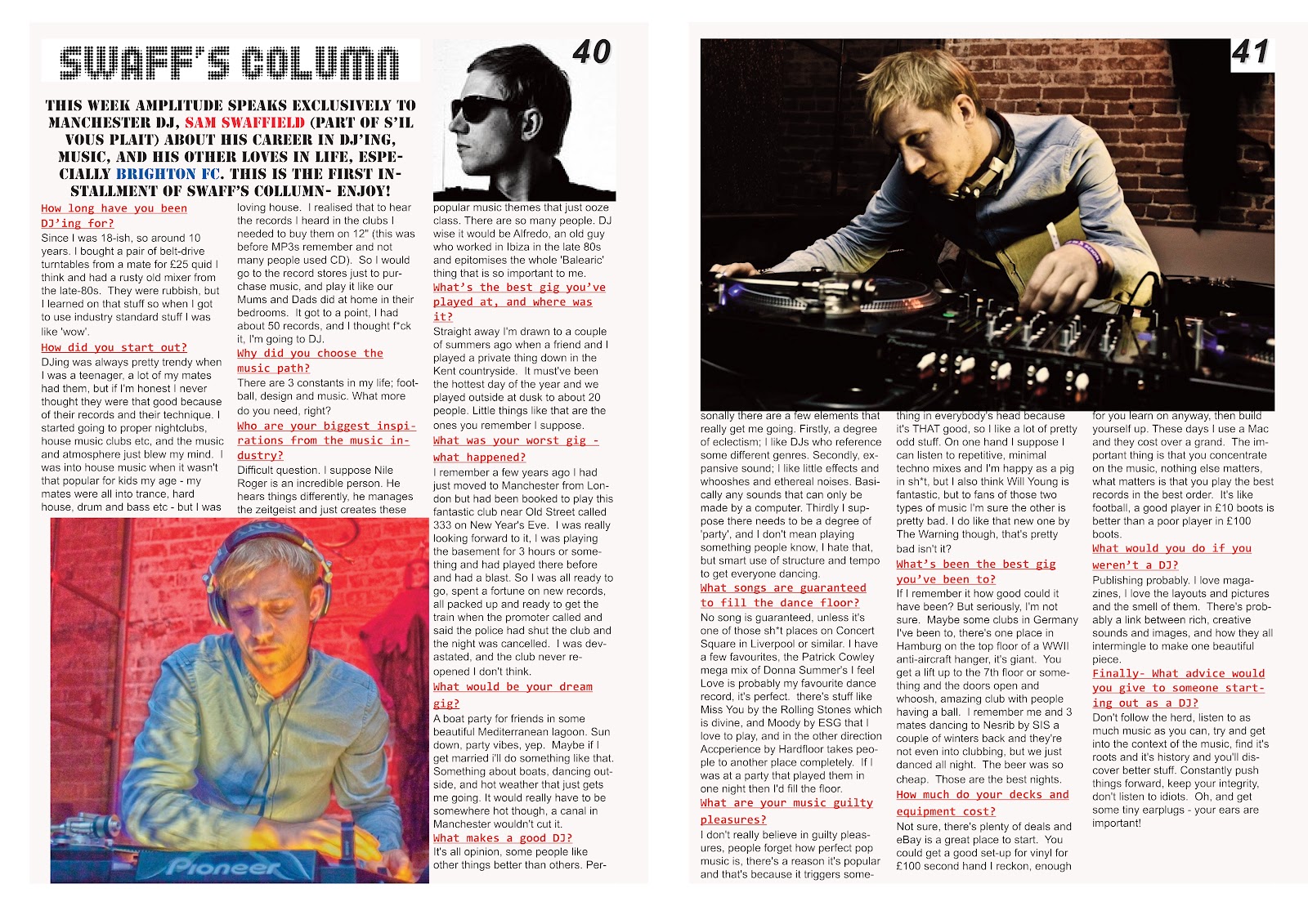
For My cover image I took pictures of Sam Swaffield, a Manchester DJ, I wanted it to take up most of the front cover and be the main focal point and central, as most real magazines have. I wanted it to blend in with the background/text and not be contrasting like some media products are and you don't know where to look on the page this is where I challenged forms of the media products. My masthead was a club land font which I got from www.dafont.com, I used the club land theme as it stood out and of course club land is well known in the house/dance music world. It was positioned at the top and the photo covers a bit of the title which is another convention of professional media products. I kept the same colour scheme throughout to give it a professional, simple yet effective feel and very effective. The main colours I used were red, white and black, and only used a few other colours for stand out effect (amp index, 1 front cover article, and highlighting a football teams name in the colour they play in). My cover lines were similar to most magazines; I had anchorage text to give the potential buyers an insight to what articles were in the magazine. These were bold and stood out against the white background of the picture. The layout of the cover lines were shaped around the picture and no text covered the face of Sam. The font and size was just a basic Photoshop one. I didn't use any other graphics apart from two parallel lines above the slogan "possibly the best dance music mag ever".
 |
| College magazine front cover |
Contents Page & DPS
The contents page I have kept it with connotations of Music Magazines contents, by keeping the pictures on the centre and right hand side of the 3 columns, and have used the left hand side for an 'amp index' a list of the articles and what artist is featured on the page. The 'swaff's column' picture is of him dj'ing at his gig that I went to in Manchester, I feel that the picture is effective and fits in well with the colour scheme throughout. I wanted it to be the biggest picture on the contents page as it was my main article/double page spread. The other photograph I used was for the 'where's Smithy' it was a picture I took of someone who fitted the bill as being quite clever (a little bit geeky) as I wanted a typical web designer look. I used 3 columns on Quark as I wanted to keep similar connotations of music magazines like NME. I wanted to use one whole column for an index, and the other 2 wouldn't be as obvious, (pictures/text going across them). The headings used was the same text for the 'contents' as the title on the front cover to keep the continuity and make readers feel that just because they've skipped a page the layout is a completely different one. For the 'swaffs column' I put it in white on top of the picture, and for 'where's Smithy' I used black on the white background, this showed the reader it was 2 different articles and they stood out more. The colour scheme was the same as the front cover again to keep continuity, and I used lime green text for the short intros into the articles under each artists name on the left hand side, this was done to draw the reader’s attention to the index after they've looked at the pictures. The style of language is a modern one and keeps with the terminology of what dance music fans would be used to. The only graphics used were drop shadow on quark.
 |
| MixMag professional DPS |
 |
Music magazine double page spread
|
 |
| my college magazine contents page |
 |
music magazine contents page
|
 |
| MixMag professional contents page |
Q2. How does your media product represent particular social groups?
My media product is for Dance and house music fans. It can be seen on the front cover where is says "probably the best dance music ever" this tells consumers what the product is and also that people think it is one of the best. It also leans towards music fans who want to be a DJ, or learn more about it if they already are. The age is for anyone who enjoys this genre of music, but generally I would suggest from 15-30 year olds as this is the age category who would find it most interesting, Sam who I used for the photos is 24 so he fits in the middle of the age range, and It shows in the layout as I feel it has a fun, 'cool' feel to it yet not put together to look childish and more of an adult made magazine with the content younger adults would want to read. The gender is more male orientated, mainly because all the pictures are of males, but females will be interested in the articles, and basic layout of the magazine. The social class is middle class, upper class wouldn't really be interested in house music and DJ'ing but that is just my opinion. The race is for everyone, I think making a magazine for a particular ethnicity is wrong and I think racist. Nothing should be divided by the colour of your skin and my magazine is for every background. The magazine has no sexuality and again is for everyone. My magazine isn't regionalised, I am from the North, and Sam who talks in the DPS is from Brighton, down south, so it has opinions of both north and south so it is for every region. Sam tells us the story of how he started out, and I think it will appeal to today's youth as job's are hard to come from and many thing if you haven't got good grades you won't get anywhere, Sam has started from scratch with Little money and made quite a name for himself on the DJ scene something that people should aspire to do. Young people are being represented in the magazine as quite cool and dance music is the music that the coolest people listen to this genre, just by looking at the front image of sam, who is a young adult, it shows him with 'shades' on and with an in fashionable hairstyle, which is the way i wanted young people to be represented, not the thugs/hoodies that the media make us out to be like. Clubbers are represented as outgoing and fun, a hobby that no one is afraid of admitting to doing and that most weekends, if you love dance music, you'll go clubbing. The class of people are represented as being the affordable type, that dance/house music is all about the music and quality of music, not just the quality of venue or the quality of champagne that the upper class would be interested in, so this heads more towards the working class society. Males are represented by regular features and more manly articles, but it doesn't have any bearing, as punk rock was very male orientated when it started, but now it is mostly about the women, so it goes with the times. But in my opinion music is asexual, anyone can listed to it and have their opinions regardless of gender, sexual orientation or race.
Q3. What kind of media institution might distribute your media product and why?
When researching the types of media institutions I looked at 3 different ones, Bauer who publish Q and Kerrang, IPC who publish NME and Future Publishing who publish Classic Rock, Total Guitar and other guitar magazines. I would choose IPC to publish magazines, as they publish one of the most successful music magazines in NME, and have lots of different types of magazines so aren't afraid to mix and match their product range, there is also a gap in their market for a dance/house music magazine as they don't publish one and they generally publish older age range magazines so this will give them another string to their bow and appeal to the younger audience which Bauer and others do. They publish such things as Marie Claire, Loaded and Golf Monthly, all top sellers in their category. They have over '85 iconic media brands' according their website. The shops/retailers I expect to see my magazine would be; WHsmiths, HMV, Dance Gigs (on the door/stalls), Newsagents and on-line through our own website offering 'special discounts'.
 |
| Festival/gig stalls |
 |
| HMV, records store |
 |
| IPC's logo |
Q4. Who would the be the audience for your media product?
 |
| Young adults, 'gig goers' |
 |
| Stylish teenagers |
 |
| stylish male |
 |
| stylish female |
These are in my opinion my ideal audience, their age would range from 15-30 as it is probably the age they will most be into clubbing/dance music etc. the gender would be male and female, anyone can DJ and you can't single the magazine as being boy or girl orientated, although if i was to re-do my magazine it would be a little more feminine and a few images of girls as at the moment it seems quite masculine in the layout and style, but generally house music/dance music is generally seen as male, with very little female DJ's especially proffessional. Another point to back this up would be girls that are interested in house music, are more tom-boy than girly girls that will like pop music so the bold layout may be of interest to them. The social class will be middle/working class, mainly because upper class won't really be into clubbing and DJ'ing bur some will be so the class can be for everyone but mainly middle class is the class I think most of my magazine would sell to. Their clothes sense would be fashionable and they would make the trends not follow them because people find them quite 'cool' and want to copy them. Hairstyles will be short and gelled, or long and styled probably the two most popular hairstyles of today and most fashion setters have this kind of haircut. Their leisure interests would be sport, hanging round with friends, and of course a love for dance/house music and DJ'ing. These things all make them my ideal audience, it has a wide age range from teen to young adult and then adult, and I wanted to keep it as an exclusive magazine, as in your showing you have good taste to your friends by buying the magazine.
Q5. How did you attract/address your audience?
For this Interviewed 2 of my friends from college, 1 boy and 1 girl, and I interviewed my cousin (age 25) so it gives me 2 different age ranges and different views from both genders. I asked them about the positive and negatives of the front cover, contents page and DPS.
1st interview: Charlotte
Me: What are the advantages of my front cover?
Charlotte: I think it looks very professional, and would really stand out on a shelf next to other magazines; also it has intriguing articles that I want to buy the magazine so I can read. The price is good value as most music magazines can be £5 for the similar number of pages.
Me: Anything else?
Charlotte: The image goes well with the text, and the shadowed effect looks amazing!
Me: any disadvantages of the front cover?
Charlotte: None!
Me: What about the contents page, what are the positives?
Charlotte: It looks like the same magazine compared to the front cover, still looks professional
me: Any negatives?
Charlotte: there should be more pictures, maybe of the editor
me: Finally your views on the double page spread
Charlotte: I like it, its looks good and the article is really interesting, and makes me want to become a DJ! The only negative I would say is that it doesn't stand out like the front cover and contents do.
2nd interview: Billy
Me: alright Billy, can you tell me what you think of my front cover of my magazine?
Billy: hi matt, I think it looks quality! Definitely something I would buy and read each week
me: negatives....?
Billy: not many, I would maybe change the yellow text as it looks a bit odd, but I suppose if you want it to stand out it looks cool.
Me: what about the contents page and DPS?
Billy: they both look good as well, the contents looks just like something you'd expect from NME or Kerrang or any other big music magazine, and I would make the subscription offer stand out more though, as it can get a bit lost with all the other text and images. The double-page spread looks really good, better than the ones that have half the page covered by a picture, the quality of the article is more important, that's just me though.
3rd interview: cousin (Lauren)
Me: hi Loz, what do you think of my magazine as a whole from the images I sent you?
Lauren: It look's smooth Matt; I'll be buying it if you start publishing it fully. The front cover's my favourite, looks like a real magazine that's been established for years, I wouldn't change anything. The contents is also brilliant, it all blends in perfectly, although I’d put more emphasis on the 'amp index' as some of the subheadings to describe each article are really witty and you're drawn to the images rather than this. The DPS is a brilliant read, and the pictures look really clear and it is a truthful interview unlike most you see. I would maybe use a background for the whole DPS, to add an extra dimension and more of a stand out feature, but it would take away the effect the images and text have.
Me: Ok thanks Loz
My opinion on how the magazine has appealed to the audience
Has similar conventions to house/dance music magazines
Bold and looks proffessional
Appeals to a wide range of audience (15-30)
Minimal colours and matching colour scheme for continuity
Cheap
Interesting article/DPS
Down to earth articles, give readers a chance to be like them.
Q6. What have you learnt about technologies from the process of constructing this product?
From constructing my media products I have learnt a lot more about media and how to publish magazines, it also has shown me how to use Photoshop which I thought was very complicated at first. I have found out how easy it is to research into publishers and magazines companies through the internet and this helped me choose what my magazine would feature. I found blogging fun, at first I was unsure about it, but it's easier than writing it out, or printing everything out and keeping in a folder. It made me more organised and was easy to tick off what I had done and what I needed to do, it also was handy as other people can view your blog and one person commented telling me what price my magazine should be which helped. I also improved my photography skills; I used my stepdad's camera which was an expensive SLR camera so I was able to take good quality photos of my step brother for the college magazine and Sam for the music magazine. I also learnt how to create shadows and take a picture. I found Photoshop a lot easier towards the end for manipulating images, although I didn't have much to change as the photos were how I wanted them. Photoshop was very good for designing the front cover, I designed it at home, but the picture on the layer and then worked around it, it was easy to make it look professional and to the spec I wanted,
I also found out how to align the text and move it about as well as bringing to front the image from the title.
Quark was good for combining text and images together, it was easy to put a picture on and the text would mould around it rather than covering the text. It was quick and easy to change your design, which I did 5 or 6 times before finishing on the final design for the DPS and contents page.
Q7. Looking back at your preliminary task, what do you feel you have learnt in the progression from it to the full product?
For the college magazine I did very little research into the college magazine industry and just started from scratch after drawing plans and taking pictures. This is why magazine didn't look as good as it maybe should have and the contents page looked like a completely different magazine from the front cover. Again planning was minimal I just drew up a quick plan/sketch then started on the magazine, Meaning it didn't look that professional. I went and took photos of my step brother for the college magazine front cover, he was made to look like a rock star with shirt, jeans and whilst playing the guitar, maybe one thing I would have done is to use another model who had long hair more like a typical rock star, and I should have had the image as a medium close up like my music magazine rather than a full body shot that I had to crop and edit to look right. For the contents page images I decided to take pictures of students around college that fitted the type of person I wanted, however some pictures weren't the best quality so for my music magazine I wanted better quality pictures. For the journalism of the college magazine there wasn't much, I just made up typical stories to do with college rock, and put them onto the front cover/contents page, there wasn't much writing needed because we didn't have to do a DPS. In Photoshop I didn't use much digital image manipulation for the cover image apart from the lasso tool to go round the guitar/cut the waist and also the crop tool to cut unnecessary parts of the image. In quark I learnt how to draw a text box and that the text can be shaped around the image, I re-sized the pictures to the size of the box and put them in, I found this a lot easier than Photoshop which I couldn't get my head round for most of the college magazine preliminary task... I used quite a lot of design skills in Photoshop, just to try and get to grips with Photoshop, for the text I used pretty much every effect Photoshop had! Inner glow, outer glow, satin, bevel and emboss etc and I think it wasn't very stylish and stood out a bit too much rather than the image standing out. After doing the college magazine it gave me a really good idea of what to and not to do for the music magazine, I knew what things went well and keep and what things I shouldn't use. I realised from the preliminary task that research is important, so I did some market research into publishers and magazines, and also conventions of music magazine front covers and contents pages as I wanted mine to look like a professional magazine. I did an audience questionnaire and this really helped me to choose things, I was originally going to have a rock music magazine but decided against it as I had the most votes for a dance music magazine, dub step was also very high but I had no idea what this type of music was so went for something that I had a bit of knowledge about. It also gave me the name: Amplitude, which is think, is effective and sound's a lot more professional than college of rock. I used a publication plan to show me what I wanted to do and also did sketches of the front cover, contents and dps to show how I wanted to format them including what type of images. For the photography I went to one of Sam's sets/gig in Manchester and took pictures of him there, the front cover I used in the backstage part of the club was what I wanted to use, have a shadowy effect, with low key lighting and create a sense of only seeing half of Sam's personality, also by him having Ray-Bans on it covered his eyes to make him more mysterious and readers would want to read his article to see more about him. The images I used for the contents page and DPS, were of Sam actually DJ'ing and I felt my pictures were what I wanted, as they were clear, bright and showed him doing what he was good at. Whereas the college magazine wasn't your typical rock star, the pictures of Sam are obviously perfect for a DJ. The journalism part I looked into what questions I could ask Sam, so I did a list of stuff that I thought people would be interested in hearing and before his gig at his apartment I did a question and answer session with him, and then put it onto my DPS, this was a good insight into Sam's life as a DJ, and how he got into music. There was no digital image manipulation used on Photoshop and quark and I made sure my images were what I wanted and didn't need editing when taking them, the only thing was to drag them into place and put the text around it. I used a lot less design skills than on the preliminary task where almost every effect was used, I only used drop shadow on quark and Photoshop I tried different things but it had a bigger effect when the text was left basic but with a bold colour. The photos of Sam on the front cover have the effect that they have been photoshopped, but it was done all with the camera. To make this effect, I had a natural source of light from his right hand side throwing the left side of his face into shadow. Black card was used on the left hand side of Sam to absorb any stray light in the shadows. Then desaturate the colour, all this made the photo the way it was.
 |
| Final college magazine front cover |
 |
| Final college magazine contents page |
 |
| Final music magazine front cover |
 |
| Final music magazine contents page |
 |
| Final music magazine DPS |


